
DEAN & DELUCA cafe colette mare minatomirai
Interior design for a cafe on the ground floor of a commercial complex in front of Sakuragi-cho Station, the gateway to Minato Mirai.
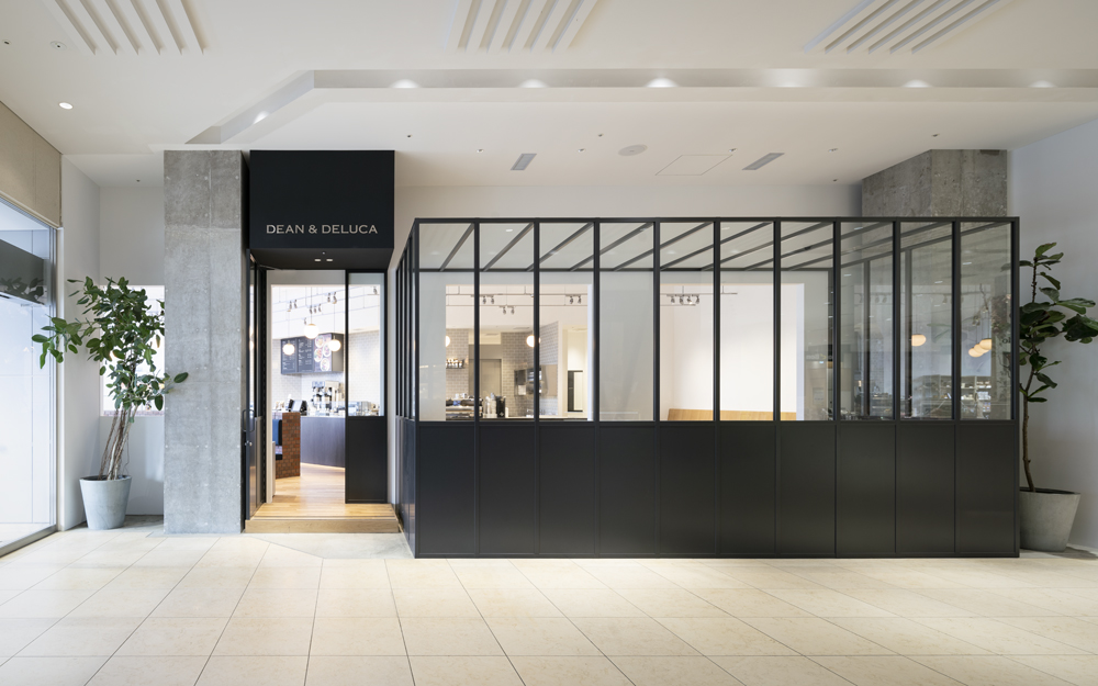
We were required to create two facades, one facing the outdoor eaves of the ground floor and the other facing the corridor inside the building. It was important to find a way to combine the face of the brand, the face of the city and the face of the facility.
We also required a space that would allow a variety of people to share the space and be able to choose the scene that best suits them, whether they are taking a break in the morning before work, having a chat after watching a film, chatting on their way home from school, having a cup of tea in between shopping trips, or having a conversation before a business meeting.
We decided to create two facades, one with a dignity and frontality as an "entrance", and the other with a sense of euphoria by the "gaze", although it is easy to enter. Although the content of the "brand" is the same, the target audience and the environment are different, so it was necessary to create a difference from the design framework.
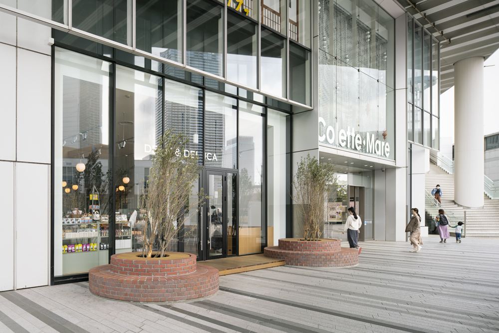
The outdoor façade is symmetrical, creating a new axis and node with a strong frontal character. In the park in front of the station, many people spend their time sitting on the edge of the planting area, and we inherited this context to create an entrance where people can sit on the edge of the planting area and relax, creating a stagnation in the heavy commuter flow in the morning and evening.
The walls and facades tend to be placed in relation to the lease line, but we created a straight demarcation wall just inside the pillars of the building, away from the lease line. This wall organises the interior space in a simple box shape, and responds to the two facades as drawing the symmetrical axis into the interior, separating it from the corridor, enhancing the interior habitability. 45 degree diagonal lines are added to this simple space by the cashier counter and the electrical ducts, allowing the traffic flow smoothly from the two facades and give movement to the space.
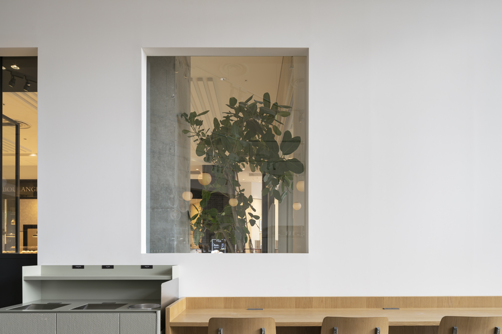
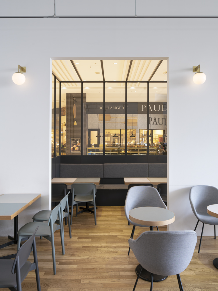
On the indoor façade, a "pseudo-terrace" was created in the space between this demarcation wall and the lease line. Together with the plantings, the eaves and the bare concrete columns, which are not found in this facility, the façade is brutal, uncontrolled and semi-natural. We are conscious of that people staying in the cafe and passing by feel a sense of euphoria by the “gaze". So as to form that relation, by the shop which is made the shop visible and invisible by the wall having a certain rhythm of openings, like a corridor, the pseudo-terrace, the planting, the pillars ,the people are made feel desire to see.
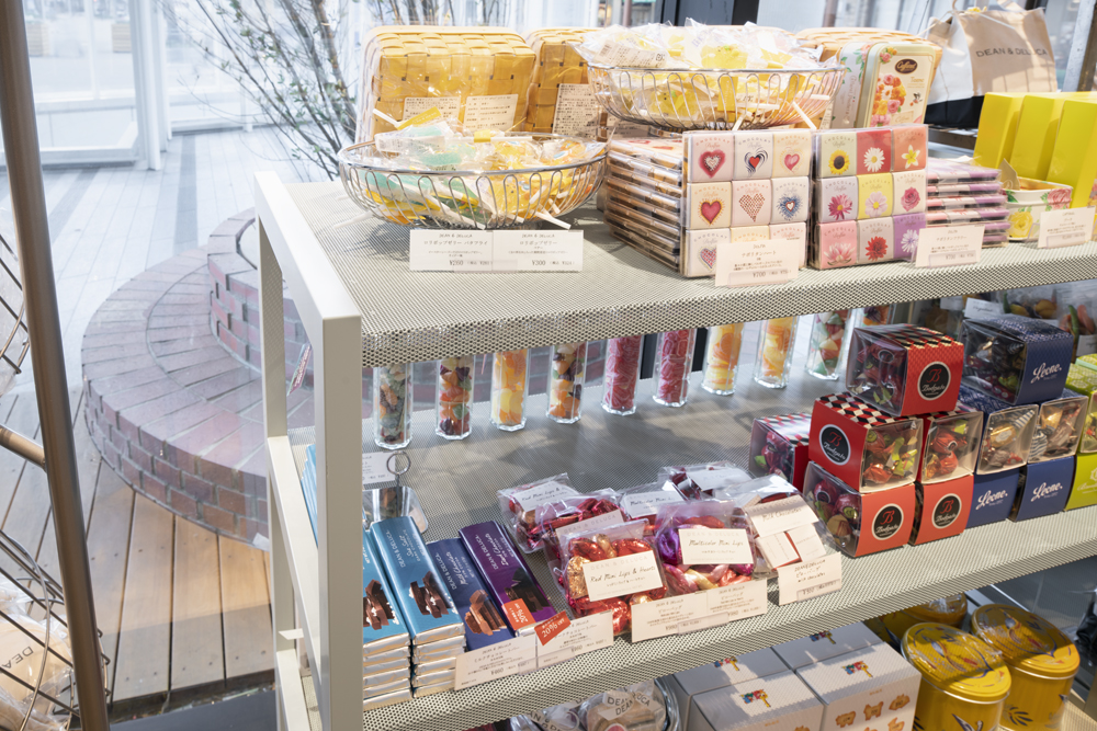
In Sakuragi-cho station, the entrance to the Minato Mirai and Shinko areas and the former Yokohama station, there are no simple elements that evoke Yokohama or the port city, so we used bricks for the benches and shelves immediately inside the shop and for the flowerbeds on both sides of the entrance porch. Ideally, this cafe will be the trigger for a context in which the bricks will be quoted in each of the internal and external spaces surrounding the park in a natural way.
From this point of view, the majority of the shops in the facility are fully open, with the interior landscape taking on the role of the façade, and the large spaces with fixtures dividing the areas, like an exhibition hall, do not seem to offer many varied viewpoints. We believe that a variety of simple simile and quotations of the corridors in the facility like this one will create a rich walking experience.
By combining a limited number of materials for elements such as seating, fixtures, counters and decorations, and grouping them in a multi-layered way, we have created a generous landscape unified but with multiple "movements", then have tried to achieve both comfort and brand.
みなとみらいの玄関口、桜木町駅前にある商業施設1Fのカフェの内装設計。
商業施設の1Fの屋外軒下空間に面した区画であるが、施設内の通路に対しても扉を設け、二つのファサードを作ることを求められた。ブランドの顔、街への顔、そして施設への顔をどう折り合わせるかが大切な点だった。
また、朝出勤前に一息入れたり、映画を見た後に少し語り合ったり、学校帰りに駄弁ったり、ショッピングの合間にお茶したり、商談前に少し打合せしたりと多様な人が空間を共有するが、各々が適したシーンを選べるような空間が求められた。
二つのファサードは、「エントランス」としての重厚さや正面性を大切にするファサードと、気軽に入れるが「まなざし(gaze)」による多幸感を生むファサードを作ることとした。「ブランド」という表現する内容は同じでも、表現する相手や環境が違うため、デザインの枠組みから差異を作る必要があった。
屋外のファサードはシンメトリーで構成し、新たな軸線と結節点を生む強い正面性を与えた。面する駅前広場には多くの人が植栽の縁に座って過ごしており、そのコンテクストを受け継ぎ、通勤の朝夕の激しすぎる人流に淀みを生んで、花壇に座って人が留まれるエントランスとした。
また、一般的に施設内通路との境の区画ラインに対して壁やファサードを設けがちだが、区画ラインとは離して、躯体の柱のすぐ内側に真っ直ぐの区画壁を作った。この区画壁は店内の空間をシンプルな箱型に整理しつつ、シンメトリーの軸線を店内まで引き込み、施設内通路と区切って店内の居住性を高め、二つのファサードに応えている。さらにこのシンプルな空間に、レジカウンターと配線ダクトで45度の斜めのラインを加え、2つのファサードからの流れをスムーズに流し、空間に動きを与えた。
屋内のファサードには、この区画壁と区画ラインとの間の空間に「擬似テラス」を設けた。植栽や庇、この施設内では見られないコンクリート剥き出しの躯体柱と相俟って、ブルータルで制御されていない、半自然を感じられるファサードとした。回廊のように一定のリズムで開口部を設けた壁面、擬似テラスや植栽、柱や視線の高さによって店内が見え隠れし、「まなざし(gaze)」をしっかりと維持することによって、店内にも施設内通路を通る人にも多幸感を感じられるよう意識した。
桜木町駅前にはみなとみらい・新港地域の玄関口かつ、元横浜駅という場所柄の割に、シンプルに横浜や港町を感じさせる要素が無いため、店内の入ってすぐのベンチ+什器やポーチ両側の花壇にレンガを使用した。この店舗がきっかけで、この広場を囲むそれぞれの内外の空間でレンガを引用していくような、自然なコンテクストができるのが理想だ。
そのような目線で見た時、この施設内では大多数の店舗が全開放で店内風景がファサードの役割を担う店が多く、展示会場のように大きな空間に什器がエリアを分けるような空間となっていて、多くの変化ある視点を獲得できるとは思えない。今回のような施設内通路の様々な捉え方や単純な引用が豊かな歩行空間を生むのではないだろうか。
客席・什器・カウンター・装飾等の要素には、限定した素材を組み合わせて、複層的にグルーピングしながら空間を構成することで、統一されながらも複数の「動き」を空間内に同居させたおおらかな風景を作り、居住性とブランドの両立を図った。
Interior design for a cafe on the ground floor of a commercial complex in front of Sakuragi-cho Station, the gateway to Minato Mirai.
We were required to create two facades, one facing the outdoor eaves of the ground floor and the other facing the corridor inside the building. It was important to find a way to combine the face of the brand, the face of the city and the face of the facility.
We also required a space that would allow a variety of people to share the space and be able to choose the scene that best suits them, whether they are taking a break in the morning before work, having a chat after watching a film, chatting on their way home from school, having a cup of tea in between shopping trips, or having a conversation before a business meeting.
We decided to create two facades, one with a dignity and frontality as an "entrance", and the other with a sense of euphoria by the "gaze", although it is easy to enter. Although the content of the "brand" is the same, the target audience and the environment are different, so it was necessary to create a difference from the design framework.
The outdoor façade is symmetrical, creating a new axis and node with a strong frontal character. In the park in front of the station, many people spend their time sitting on the edge of the planting area, and we inherited this context to create an entrance where people can sit on the edge of the planting area and relax, creating a stagnation in the heavy commuter flow in the morning and evening.
The walls and facades tend to be placed in relation to the lease line, but we created a straight demarcation wall just inside the pillars of the building, away from the lease line. This wall organises the interior space in a simple box shape, and responds to the two facades as drawing the symmetrical axis into the interior, separating it from the corridor, enhancing the interior habitability. 45 degree diagonal lines are added to this simple space by the cashier counter and the electrical ducts, allowing the traffic flow smoothly from the two facades and give movement to the space.
On the indoor façade, a "pseudo-terrace" was created in the space between this demarcation wall and the lease line. Together with the plantings, the eaves and the bare concrete columns, which are not found in this facility, the façade is brutal, uncontrolled and semi-natural. We are conscious of that people staying in the cafe and passing by feel a sense of euphoria by the “gaze". So as to form that relation, by the shop which is made the shop visible and invisible by the wall having a certain rhythm of openings, like a corridor, the pseudo-terrace, the planting, the pillars ,the people are made feel desire to see.
In Sakuragi-cho station, the entrance to the Minato Mirai and Shinko areas and the former Yokohama station, there are no simple elements that evoke Yokohama or the port city, so we used bricks for the benches and shelves immediately inside the shop and for the flowerbeds on both sides of the entrance porch. Ideally, this cafe will be the trigger for a context in which the bricks will be quoted in each of the internal and external spaces surrounding the park in a natural way.
From this point of view, the majority of the shops in the facility are fully open, with the interior landscape taking on the role of the façade, and the large spaces with fixtures dividing the areas, like an exhibition hall, do not seem to offer many varied viewpoints. We believe that a variety of simple simile and quotations of the corridors in the facility like this one will create a rich walking experience.
By combining a limited number of materials for elements such as seating, fixtures, counters and decorations, and grouping them in a multi-layered way, we have created a generous landscape unified but with multiple "movements", then have tried to achieve both comfort and brand.
みなとみらいの玄関口、桜木町駅前にある商業施設1Fのカフェの内装設計。
商業施設の1Fの屋外軒下空間に面した区画であるが、施設内の通路に対しても扉を設け、二つのファサードを作ることを求められた。ブランドの顔、街への顔、そして施設への顔をどう折り合わせるかが大切な点だった。
また、朝出勤前に一息入れたり、映画を見た後に少し語り合ったり、学校帰りに駄弁ったり、ショッピングの合間にお茶したり、商談前に少し打合せしたりと多様な人が空間を共有するが、各々が適したシーンを選べるような空間が求められた。
二つのファサードは、「エントランス」としての重厚さや正面性を大切にするファサードと、気軽に入れるが「まなざし(gaze)」による多幸感を生むファサードを作ることとした。「ブランド」という表現する内容は同じでも、表現する相手や環境が違うため、デザインの枠組みから差異を作る必要があった。
屋外のファサードはシンメトリーで構成し、新たな軸線と結節点を生む強い正面性を与えた。面する駅前広場には多くの人が植栽の縁に座って過ごしており、そのコンテクストを受け継ぎ、通勤の朝夕の激しすぎる人流に淀みを生んで、花壇に座って人が留まれるエントランスとした。
また、一般的に施設内通路との境の区画ラインに対して壁やファサードを設けがちだが、区画ラインとは離して、躯体の柱のすぐ内側に真っ直ぐの区画壁を作った。この区画壁は店内の空間をシンプルな箱型に整理しつつ、シンメトリーの軸線を店内まで引き込み、施設内通路と区切って店内の居住性を高め、二つのファサードに応えている。さらにこのシンプルな空間に、レジカウンターと配線ダクトで45度の斜めのラインを加え、2つのファサードからの流れをスムーズに流し、空間に動きを与えた。
屋内のファサードには、この区画壁と区画ラインとの間の空間に「擬似テラス」を設けた。植栽や庇、この施設内では見られないコンクリート剥き出しの躯体柱と相俟って、ブルータルで制御されていない、半自然を感じられるファサードとした。回廊のように一定のリズムで開口部を設けた壁面、擬似テラスや植栽、柱や視線の高さによって店内が見え隠れし、「まなざし(gaze)」をしっかりと維持することによって、店内にも施設内通路を通る人にも多幸感を感じられるよう意識した。
桜木町駅前にはみなとみらい・新港地域の玄関口かつ、元横浜駅という場所柄の割に、シンプルに横浜や港町を感じさせる要素が無いため、店内の入ってすぐのベンチ+什器やポーチ両側の花壇にレンガを使用した。この店舗がきっかけで、この広場を囲むそれぞれの内外の空間でレンガを引用していくような、自然なコンテクストができるのが理想だ。
そのような目線で見た時、この施設内では大多数の店舗が全開放で店内風景がファサードの役割を担う店が多く、展示会場のように大きな空間に什器がエリアを分けるような空間となっていて、多くの変化ある視点を獲得できるとは思えない。今回のような施設内通路の様々な捉え方や単純な引用が豊かな歩行空間を生むのではないだろうか。
客席・什器・カウンター・装飾等の要素には、限定した素材を組み合わせて、複層的にグルーピングしながら空間を構成することで、統一されながらも複数の「動き」を空間内に同居させたおおらかな風景を作り、居住性とブランドの両立を図った。