
Ao-Hata Bookstore
A bookshop selling art books with a gallery function where artists can exhibit their works.
The first floor, which used to be a maisonette for a pub on the ground floor, is now an independent space, with only an old staircase at the back of the space. It was not a space that you wanted to enter, it even had an atmosphere that you were not allowed to enter.
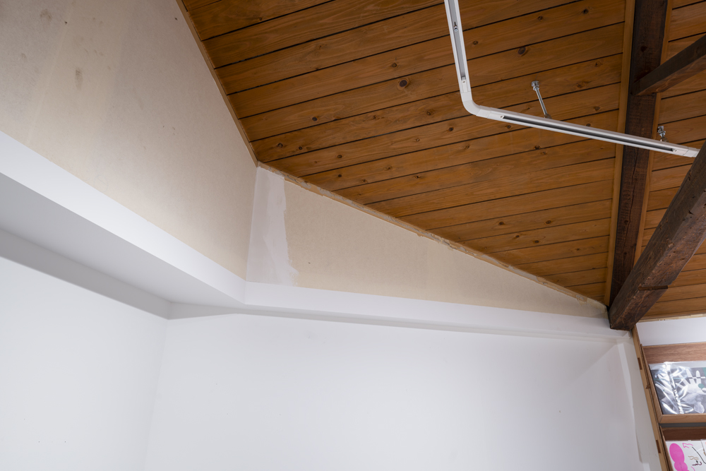
The second floor seemed to be a building that had been heavily extended and renovated, with unusually low ceilings and raised floors that resulted in unusually low domestic aluminium sashes, reddish flooring and bumped wallpaper.
We decided to create an attractive "entrance" on the first floor and a "sun shutter" on the second floor to adjust the space.
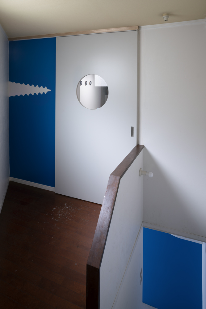
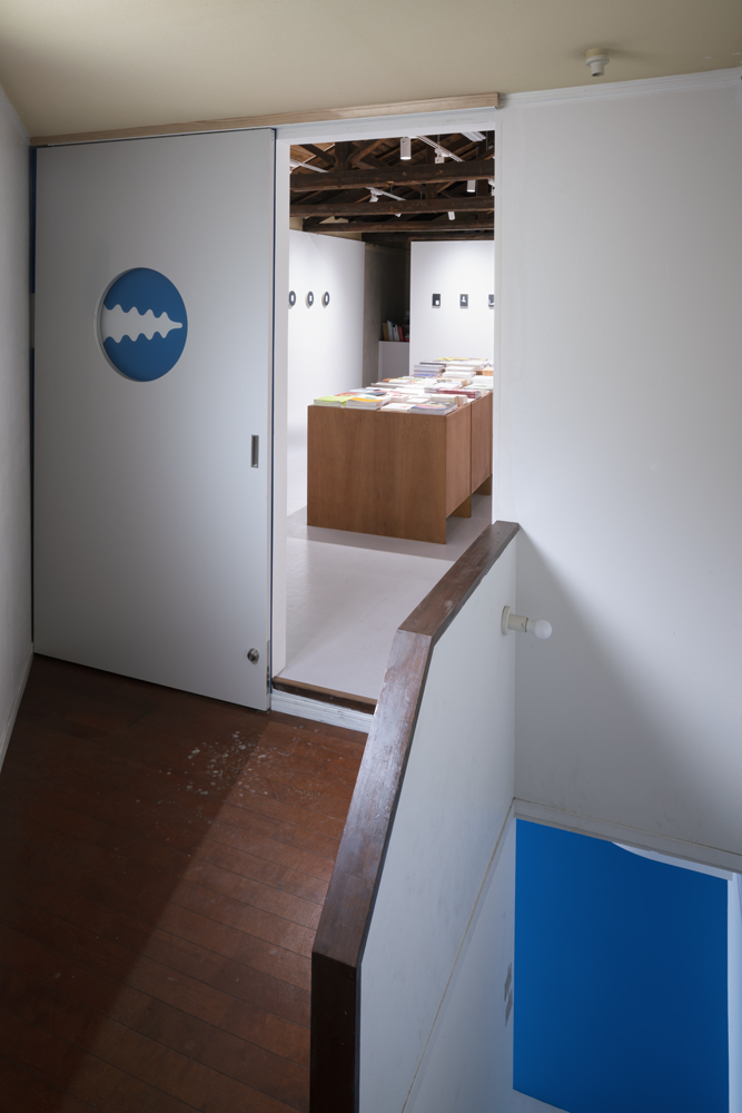
The plan of the first floor is a right triangle, the hypotenuse side is open, and a dark staircase leading to the corner, which was made as a back space. We felt that the space had a slight sense of drama, glamour and festivity, similar to the staircase for the entrance to a stage set or the perspective backdrop of the Teatro Olimpico, and adjusted the walls, the number of steps and the approach to the entrance.
The dramatic blue colour of the logo was used to create a blue wall at the entrance, and the ventilation duct of the shop next door and the stairs were used to create a wall that evokes the logo. It was a coincidence that the colour contrasted so well with the colours of the city, but perhaps it was inevitable that blue, with its freshness and sense of otherness and surprise, should be the theme colour against the red and orange that the Fukuoka cityscape favoured.
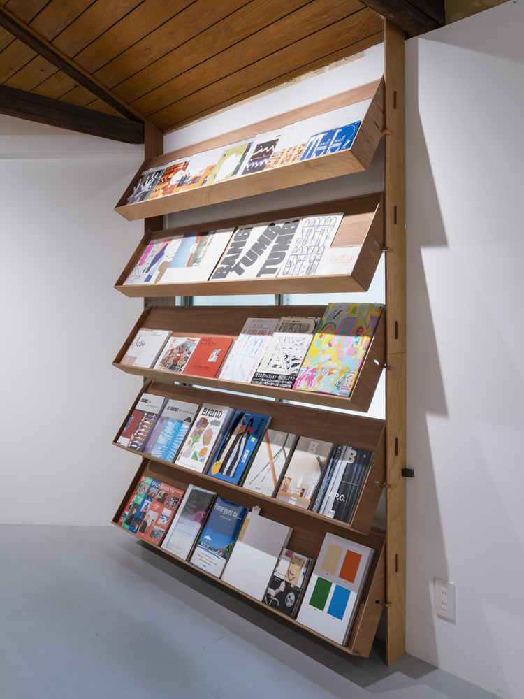
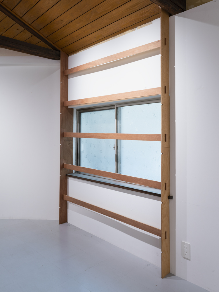
On the second floor, the halfway low-placed aluminium sashes, which create a homely atmosphere, create an obtrusive light that creates glare at the same height as the artwork, reducing the wall surface for the exhibition and book display, and also bringing a sense of ordinary scale into a space that is intended to be extraordinary. To solve this problem, we installed sun shutters to control the light in the room and to display books on the slats of the sun shutters. The slats are made of boxed plywood and can be adjusted in three different positions, depending on the light level and the content of the display.
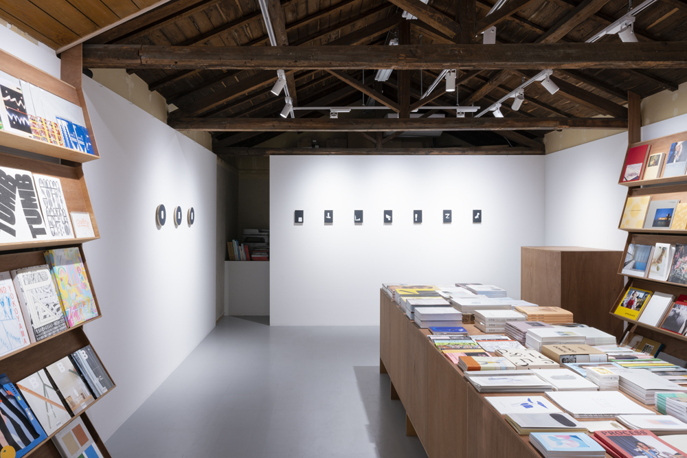
In the existing structure, we left the unorganised parts of the attic, the shed and the upper part of the walls as noisy parts, and we arranged and painted the walls to a set height, like a “kakewake” glaze. A sequence of huts frame with strong morphological characteristics is not noticeable, and the grouping is simplified: roof, hut, wooden furniture/ wall/ floor/ books, artwork.
The simple and uncluttered grouping creates a sense of tension, but at the same time, by using the eloquence of the existing building, the proscenium arch/brand logo and the sun shutters/products create a new viewpoint and close relationship to the existing building, and create both tension and intimacy.As a result, we were able to reconcile a brilliant opening to the city, inviting passers-by, and the extraordinary presence of art and books, with their different colours, shapes and textures, in an ordinary space, with a high contrast, but accessible and memorable.
作家の展示を行えるギャラリー機能のあるアートブックを扱う本屋。
1階の居酒屋の倉庫としてメゾネット状に使用されていた2階を独立させた空間で、入ると古びた階段が空間の奥にそっぽ向いて置かれているだけだった。決して入りたい空間ではなく、入ってはいけない雰囲気さえ持っていた。
2階の空間は増改築を激しく加えた建物らしく、異常に低い天井と上げ床により異常に低い位置にある尺寸の家庭用アルミサッシ、赤みの強いフローリングにバンプの強い壁紙という用途にはそぐわない空間だった。
そこで、1Fでは魅力的な「エントランス」を、2Fでは空間を調整する「サンシャッター」を設けることとした。
1Fエントランスの平面は直角三角形の斜辺がオープンであり、隅へ向かっていく暗い階段があるという裏の空間として作られた設えであったが、どこか舞台のセットの登場用やオリンピコ劇場等のパースペクティブを強調した階段が持つドラマ性や華やかさ、祝祭性を感じ、壁面や階段の段数やアプローチを調整してそのエントランスを整えた。
そしてロゴに採用されていたドラマティックな青を引用し、エントランスの壁一面を青とし、隣の店舗の換気ダクトや階段を利用して、壁面全体でロゴを連想させるようにした。街の色合いとコントラストの高い色だったのは偶然ではあったが、赤やオレンジを好む福岡の街並みに対して、爽やかさと異質感・驚きのある青がテーマカラーだったのは必然だったのかもしれない。
2Fでは、家庭的な雰囲気を漂わせてしまう中途半端に低い位置のアルミサッシは、作品と同じ高さでグレアを生む邪魔な光を生み出し、展示や本の陳列の壁面を減らし、さらには非日常感を演出したい空間に日常のスケール感を持ち込んでしまう。そこで、室内の光を調整できるサンシャッターを設け、さらにそのサンシャッターのスラットに本をディスプレイできるようにした。合板を箱組したスラットを作り、スラットは3段階の調節ができ、光量の調整とディスプレイの内容から、適した傾きが決まるようにした。
また、既存躯体には、屋根裏・小屋組や壁面上部の整理しきれない部分を素のままのノイズのある部分として残し、釉薬の掛分けのように設定した高さまで壁面の造作や段差を整理・塗装した。形態的な特徴の強い小屋組の連続などが悪目立ちせず、屋根・小屋組+木製什器/壁面/床/商品とグルーピングを単純化させた。
シンプルで淡白なグルーピングによって緊張感を与えつつも、既存建物の饒舌さを組み込むようにプロセニアムアーチ/ブランドロゴやサンシャッター/商品という既存建物への新たな視点・密接な関係をもたせ、緊張感と親近感を両立させた。結果、街ゆく人を誘う街に開かれた鮮やかな開口、色も形も様々で質感のあるアートや本という非日常の存在を、コントラスト高くも手にとりやすく記憶に残るように、日常的な空間に融和させることができた。
A bookshop selling art books with a gallery function where artists can exhibit their works.
The first floor, which used to be a maisonette for a pub on the ground floor, is now an independent space, with only an old staircase at the back of the space. It was not a space that you wanted to enter, it even had an atmosphere that you were not allowed to enter.
The second floor seemed to be a building that had been heavily extended and renovated, with unusually low ceilings and raised floors that resulted in unusually low domestic aluminium sashes, reddish flooring and bumped wallpaper.
We decided to create an attractive "entrance" on the first floor and a "sun shutter" on the second floor to adjust the space.
The plan of the first floor is a right triangle, the hypotenuse side is open, and a dark staircase leading to the corner, which was made as a back space. We felt that the space had a slight sense of drama, glamour and festivity, similar to the staircase for the entrance to a stage set or the perspective backdrop of the Teatro Olimpico, and adjusted the walls, the number of steps and the approach to the entrance.
The dramatic blue colour of the logo was used to create a blue wall at the entrance, and the ventilation duct of the shop next door and the stairs were used to create a wall that evokes the logo. It was a coincidence that the colour contrasted so well with the colours of the city, but perhaps it was inevitable that blue, with its freshness and sense of otherness and surprise, should be the theme colour against the red and orange that the Fukuoka cityscape favoured.
On the second floor, the halfway low-placed aluminium sashes, which create a homely atmosphere, create an obtrusive light that creates glare at the same height as the artwork, reducing the wall surface for the exhibition and book display, and also bringing a sense of ordinary scale into a space that is intended to be extraordinary. To solve this problem, we installed sun shutters to control the light in the room and to display books on the slats of the sun shutters. The slats are made of boxed plywood and can be adjusted in three different positions, depending on the light level and the content of the display.
In the existing structure, we left the unorganised parts of the attic, the shed and the upper part of the walls as noisy parts, and we arranged and painted the walls to a set height, like a “kakewake” glaze. A sequence of huts frame with strong morphological characteristics is not noticeable, and the grouping is simplified: roof, hut, wooden furniture/ wall/ floor/ books, artwork.
The simple and uncluttered grouping creates a sense of tension, but at the same time, by using the eloquence of the existing building, the proscenium arch/brand logo and the sun shutters/products create a new viewpoint and close relationship to the existing building, and create both tension and intimacy.As a result, we were able to reconcile a brilliant opening to the city, inviting passers-by, and the extraordinary presence of art and books, with their different colours, shapes and textures, in an ordinary space, with a high contrast, but accessible and memorable.
作家の展示を行えるギャラリー機能のあるアートブックを扱う本屋。
1階の居酒屋の倉庫としてメゾネット状に使用されていた2階を独立させた空間で、入ると古びた階段が空間の奥にそっぽ向いて置かれているだけだった。決して入りたい空間ではなく、入ってはいけない雰囲気さえ持っていた。
2階の空間は増改築を激しく加えた建物らしく、異常に低い天井と上げ床により異常に低い位置にある尺寸の家庭用アルミサッシ、赤みの強いフローリングにバンプの強い壁紙という用途にはそぐわない空間だった。
そこで、1Fでは魅力的な「エントランス」を、2Fでは空間を調整する「サンシャッター」を設けることとした。
1Fエントランスの平面は直角三角形の斜辺がオープンであり、隅へ向かっていく暗い階段があるという裏の空間として作られた設えであったが、どこか舞台のセットの登場用やオリンピコ劇場等のパースペクティブを強調した階段が持つドラマ性や華やかさ、祝祭性を感じ、壁面や階段の段数やアプローチを調整してそのエントランスを整えた。
そしてロゴに採用されていたドラマティックな青を引用し、エントランスの壁一面を青とし、隣の店舗の換気ダクトや階段を利用して、壁面全体でロゴを連想させるようにした。街の色合いとコントラストの高い色だったのは偶然ではあったが、赤やオレンジを好む福岡の街並みに対して、爽やかさと異質感・驚きのある青がテーマカラーだったのは必然だったのかもしれない。
2Fでは、家庭的な雰囲気を漂わせてしまう中途半端に低い位置のアルミサッシは、作品と同じ高さでグレアを生む邪魔な光を生み出し、展示や本の陳列の壁面を減らし、さらには非日常感を演出したい空間に日常のスケール感を持ち込んでしまう。そこで、室内の光を調整できるサンシャッターを設け、さらにそのサンシャッターのスラットに本をディスプレイできるようにした。合板を箱組したスラットを作り、スラットは3段階の調節ができ、光量の調整とディスプレイの内容から、適した傾きが決まるようにした。
また、既存躯体には、屋根裏・小屋組や壁面上部の整理しきれない部分を素のままのノイズのある部分として残し、釉薬の掛分けのように設定した高さまで壁面の造作や段差を整理・塗装した。形態的な特徴の強い小屋組の連続などが悪目立ちせず、屋根・小屋組+木製什器/壁面/床/商品とグルーピングを単純化させた。
シンプルで淡白なグルーピングによって緊張感を与えつつも、既存建物の饒舌さを組み込むようにプロセニアムアーチ/ブランドロゴやサンシャッター/商品という既存建物への新たな視点・密接な関係をもたせ、緊張感と親近感を両立させた。結果、街ゆく人を誘う街に開かれた鮮やかな開口、色も形も様々で質感のあるアートや本という非日常の存在を、コントラスト高くも手にとりやすく記憶に残るように、日常的な空間に融和させることができた。