
OBG eu.
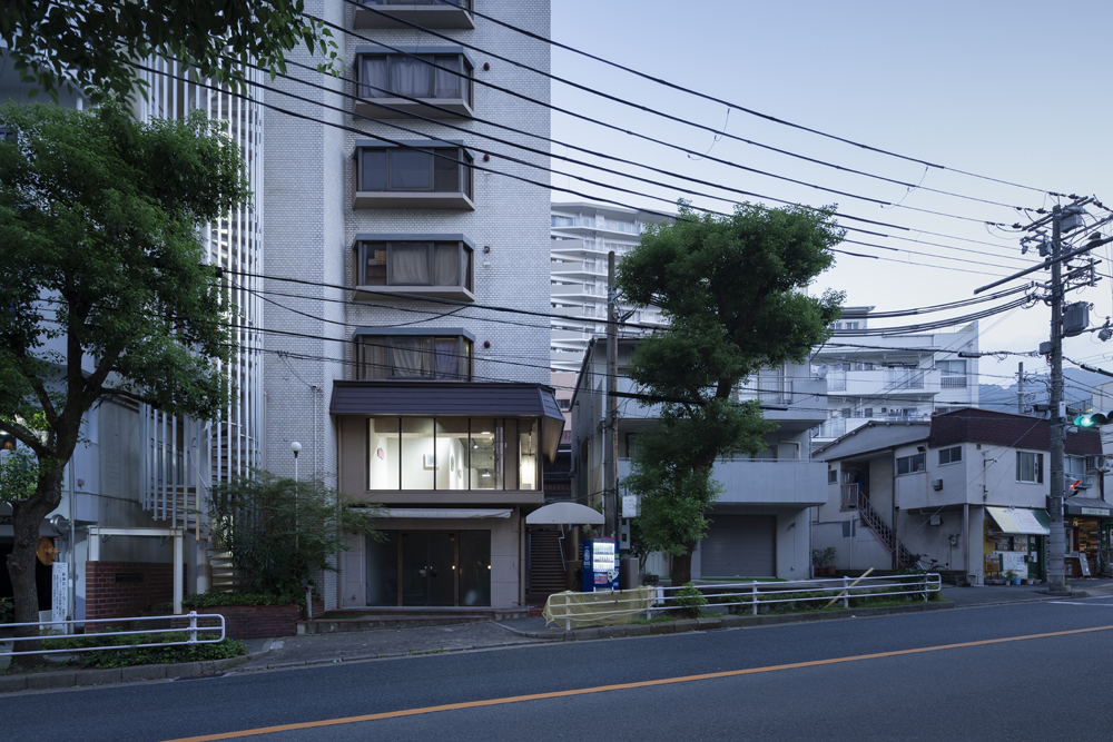
Interior design for a shop selling interior goods in a quiet residential area on the border between the mountains and the city.
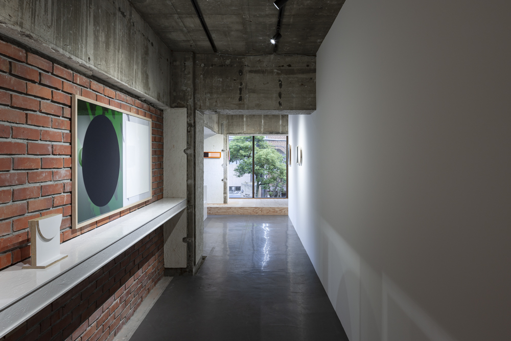
Originally a ballet school, the tenant has two entrances, one of which is a brick tiled approach dedicated to the tenant. A brick arched niche next to the entrance gave the shop a glamorous feel. There were also a number of indoor areas that still retained the multi-ethnic character of Kobe, such as the ornate lantern-shaped tiles in the washrooms and toilets.
Furthermore, when the existing simple wallpapered walls and ceilings were dismantled, brick walls, an elastomeric paint with the attractive textured finish that appear to be several generations old, and the remains of tiles that had been removed were revealed. How to make these traces coexist, how to layer the next additions, how to place the objects in such a way that the existing finishes are neither too forward nor too backward, but that they colour the space and give it a sense of the richness of the layers.
The following textures were identified as characteristic of the existing interior
Brick wall: the back side of the brick niche in the approach, which is not attached to the wall but stands alone as a masonry structure.
an elastomeric paint with the attractive textured finish: The pint were spray-painted onto the concrete frame, after the removal of the brickwork at the corners.
Chisel markings: a few generations ago, probably tiles were roughly removed sometime later.
Lantern-shaped tiles: pop and flamboyant shapes reminiscent of diamonds and spades, and decorative tiles with a different pattern on each one, as if they were made of pottery (Kobe exported many tiles to Asia).
The arched wooden door: a door with mouldings, which was originally installed in the washroom but has been relocated and reused.
Wallpaper removed from the backing paper: cream-coloured backing paper left haphazardly after the wallpaper was removed from the mortar base of the building.
Rolled PVC sheeting: ballet linoleum, which has been optimised for ballet gliding and has a subdued, glossy grey, slightly modern feel.
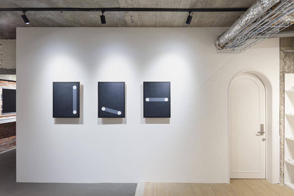
These finishes, which have been used for generations, have been rethought, modified and made to coexist. The surface of these finishes is fragmented, masked by the white fixtures and the bent walls, and depending on the intensity of the texture, it is applied to the plan. Since most of the products are small and the paintings for the exhibition are not so large, we have planned four distinctive areas, taking into account the quality of the space created by the existing fragmented textures, as well as the fragmentation of the long and narrow space.
The fixtures are made of OSB plywood painted glossy white, and when looking at the products carefully, the slightly abstract and rough texture of the background fixtures is perceived, giving a frontality to the delicacy of the products and their "patterns". The "pattern" is a symbol of the artist's way of looking at the world, and I aimed to create an interior with such a resolution that it can only become a background when the symbol is placed.
I used brass for the glass tops of the counter tables to match the brass lighting that I brought with me from the old shop when I moved here, to create a slightly different atmosphere.
山と街の境いの閑静な住宅街にあるインテリア雑貨を扱う店舗の内装設計。
元々バレエ教室だったこのテナントは、二つの入口を持ち、一つはこのテナント専用のレンガタイル張りのアプローチだった。エントランス横にはレンガ積みのアーチ型のニッチがあるなど、華やかな雰囲気を持っていた。また、屋内にも洗面所とトイレに華やかで装飾的なランタン型のタイルが張られるなど、多民族が混ざり合っている神戸らしさを感じる箇所がいくつか残っていた。
さらに、既存の壁紙のシンプルな壁天井を解体すると、レンガの壁や、何世代か前に作られたと思われるテクスチャーの豊かな吹き付けタイル仕上げ、タイルが剥がされた跡が現れた。これらの跡をどう共存させ、次に加えるものをどう積層させていくのか、既存の仕上げが前に出過ぎず下がり過ぎもしない、しかし既存の仕上げによって空間が彩られ、積層の豊かさを感じられるオブジェクトの置かれ方を考えた。
既存の内装に認めた特徴あるテクスチャは以下のようなものがあった。
・レンガ壁:アプローチにあるレンガのニッチの裏側であり、張り付けるのではなく組積造として自立した壁
・吹き付けタイル仕上げ:出隅に付いていた見切り材を撤去し、コンクリート躯体に貼り付いているような下塗りモルタル+吹き付けタイル仕上げ
・ハツリ跡:数世代前の内装、恐らくタイル等をその後のいつかの世代に荒々しく撤去した跡
・ランタン型のタイル:ダイヤやスペードを想起させるようなポップで華やかな形に、焼き物のような一枚一枚柄の違う装飾的なタイル(多くのタイルをアジアに輸出していた神戸らしさが感じられた)
・アーチ型の木製扉:洗面所に取り付けられたものを移設して再利用した、モールディングが施された扉
・壁紙を剥がした裏紙:躯体のモルタル下塗りに貼られた壁紙を剥がし、無造作に残ったクリーム色の裏紙
・ロールで施工された塩ビシート:バレエ用リノリウムと言われる、バレエに最適な滑りに調整されているもので、落ち着いた艶のあるグレーの、少しモダンな質感の床
このように何世代かに渡って多い重ねられてきた仕上げを、視点を変えて捉え直し、改変し、共存させた。また、それらの表層を真っ白の什器と折れ曲がった壁面によってマスキングしていくように断片化して、その質感の強さによっては平面計画にも反映させた。商品は小さいものが多く、展示の際の絵画などもそれほど大きくないので、細長い空間を折り曲げて分節しながら、さらに断片化した既存のテクスチャが作り出す空間の質も考慮して、4つの特色あるエリアを計画した。
什器にはOSB合板を艶のある白に塗ったものを使用し、じっくり商品を見ていると、その背景となる什器の少し抽象的で荒いテクスチャが知覚され、商品の繊細さやその「模様」に正面性を与える。「模様」は、作家の世界の捉え方・切り口からみた世界を表すシンボルであり、そのシンボルが置かれた時に初めて背景として成り立ちうるぐらいの解像度で作られた内装を目指した。
旧店舗から移転に伴って持ってきた真鍮の照明に合わせて、カウンターテーブルのガラス天板の見切り材にも真鍮を使い、少しだけ雰囲気の違う舞台として作った。
Interior design for a shop selling interior goods in a quiet residential area on the border between the mountains and the city.
Originally a ballet school, the tenant has two entrances, one of which is a brick tiled approach dedicated to the tenant. A brick arched niche next to the entrance gave the shop a glamorous feel. There were also a number of indoor areas that still retained the multi-ethnic character of Kobe, such as the ornate lantern-shaped tiles in the washrooms and toilets.
Furthermore, when the existing simple wallpapered walls and ceilings were dismantled, brick walls, an elastomeric paint with the attractive textured finish that appear to be several generations old, and the remains of tiles that had been removed were revealed. How to make these traces coexist, how to layer the next additions, how to place the objects in such a way that the existing finishes are neither too forward nor too backward, but that they colour the space and give it a sense of the richness of the layers.
The following textures were identified as characteristic of the existing interior
Brick wall: the back side of the brick niche in the approach, which is not attached to the wall but stands alone as a masonry structure.
an elastomeric paint with the attractive textured finish: The pint were spray-painted onto the concrete frame, after the removal of the brickwork at the corners.
Chisel markings: a few generations ago, probably tiles were roughly removed sometime later.
Lantern-shaped tiles: pop and flamboyant shapes reminiscent of diamonds and spades, and decorative tiles with a different pattern on each one, as if they were made of pottery (Kobe exported many tiles to Asia).
The arched wooden door: a door with mouldings, which was originally installed in the washroom but has been relocated and reused.
Wallpaper removed from the backing paper: cream-coloured backing paper left haphazardly after the wallpaper was removed from the mortar base of the building.
Rolled PVC sheeting: ballet linoleum, which has been optimised for ballet gliding and has a subdued, glossy grey, slightly modern feel.
These finishes, which have been used for generations, have been rethought, modified and made to coexist. The surface of these finishes is fragmented, masked by the white fixtures and the bent walls, and depending on the intensity of the texture, it is applied to the plan. Since most of the products are small and the paintings for the exhibition are not so large, we have planned four distinctive areas, taking into account the quality of the space created by the existing fragmented textures, as well as the fragmentation of the long and narrow space.
The fixtures are made of OSB plywood painted glossy white, and when looking at the products carefully, the slightly abstract and rough texture of the background fixtures is perceived, giving a frontality to the delicacy of the products and their "patterns". The "pattern" is a symbol of the artist's way of looking at the world, and I aimed to create an interior with such a resolution that it can only become a background when the symbol is placed.
I used brass for the glass tops of the counter tables to match the brass lighting that I brought with me from the old shop when I moved here, to create a slightly different atmosphere.
山と街の境いの閑静な住宅街にあるインテリア雑貨を扱う店舗の内装設計。
元々バレエ教室だったこのテナントは、二つの入口を持ち、一つはこのテナント専用のレンガタイル張りのアプローチだった。エントランス横にはレンガ積みのアーチ型のニッチがあるなど、華やかな雰囲気を持っていた。また、屋内にも洗面所とトイレに華やかで装飾的なランタン型のタイルが張られるなど、多民族が混ざり合っている神戸らしさを感じる箇所がいくつか残っていた。
さらに、既存の壁紙のシンプルな壁天井を解体すると、レンガの壁や、何世代か前に作られたと思われるテクスチャーの豊かな吹き付けタイル仕上げ、タイルが剥がされた跡が現れた。これらの跡をどう共存させ、次に加えるものをどう積層させていくのか、既存の仕上げが前に出過ぎず下がり過ぎもしない、しかし既存の仕上げによって空間が彩られ、積層の豊かさを感じられるオブジェクトの置かれ方を考えた。
既存の内装に認めた特徴あるテクスチャは以下のようなものがあった。
・レンガ壁:アプローチにあるレンガのニッチの裏側であり、張り付けるのではなく組積造として自立した壁
・吹き付けタイル仕上げ:出隅に付いていた見切り材を撤去し、コンクリート躯体に貼り付いているような下塗りモルタル+吹き付けタイル仕上げ
・ハツリ跡:数世代前の内装、恐らくタイル等をその後のいつかの世代に荒々しく撤去した跡
・ランタン型のタイル:ダイヤやスペードを想起させるようなポップで華やかな形に、焼き物のような一枚一枚柄の違う装飾的なタイル(多くのタイルをアジアに輸出していた神戸らしさが感じられた)
・アーチ型の木製扉:洗面所に取り付けられたものを移設して再利用した、モールディングが施された扉
・壁紙を剥がした裏紙:躯体のモルタル下塗りに貼られた壁紙を剥がし、無造作に残ったクリーム色の裏紙
・ロールで施工された塩ビシート:バレエ用リノリウムと言われる、バレエに最適な滑りに調整されているもので、落ち着いた艶のあるグレーの、少しモダンな質感の床
このように何世代かに渡って多い重ねられてきた仕上げを、視点を変えて捉え直し、改変し、共存させた。また、それらの表層を真っ白の什器と折れ曲がった壁面によってマスキングしていくように断片化して、その質感の強さによっては平面計画にも反映させた。商品は小さいものが多く、展示の際の絵画などもそれほど大きくないので、細長い空間を折り曲げて分節しながら、さらに断片化した既存のテクスチャが作り出す空間の質も考慮して、4つの特色あるエリアを計画した。
什器にはOSB合板を艶のある白に塗ったものを使用し、じっくり商品を見ていると、その背景となる什器の少し抽象的で荒いテクスチャが知覚され、商品の繊細さやその「模様」に正面性を与える。「模様」は、作家の世界の捉え方・切り口からみた世界を表すシンボルであり、そのシンボルが置かれた時に初めて背景として成り立ちうるぐらいの解像度で作られた内装を目指した。
旧店舗から移転に伴って持ってきた真鍮の照明に合わせて、カウンターテーブルのガラス天板の見切り材にも真鍮を使い、少しだけ雰囲気の違う舞台として作った。