
古い雑居ビルを改装して4店舗を1店舗に改編するプロジェクト。
4店舗それぞれのキャラクターを保ちつつも、店舗としての統一感を求められた。
また、ファンの多い店舗であり、それぞれの店舗の雰囲気を維持する必要があるが、同時にオーナーからの変化への期待も感じられた。
既存の店のおおらかな雰囲気を保ちつつもパリッとした新鮮な緊張感を両立させる事を主題とした。
そしてそのような空気を漂わせるファサードを求められた。
そこで、空間の「水準」を調整することで、細部まで建物を余すことなく食べ(使い)尽くすことを考えた。
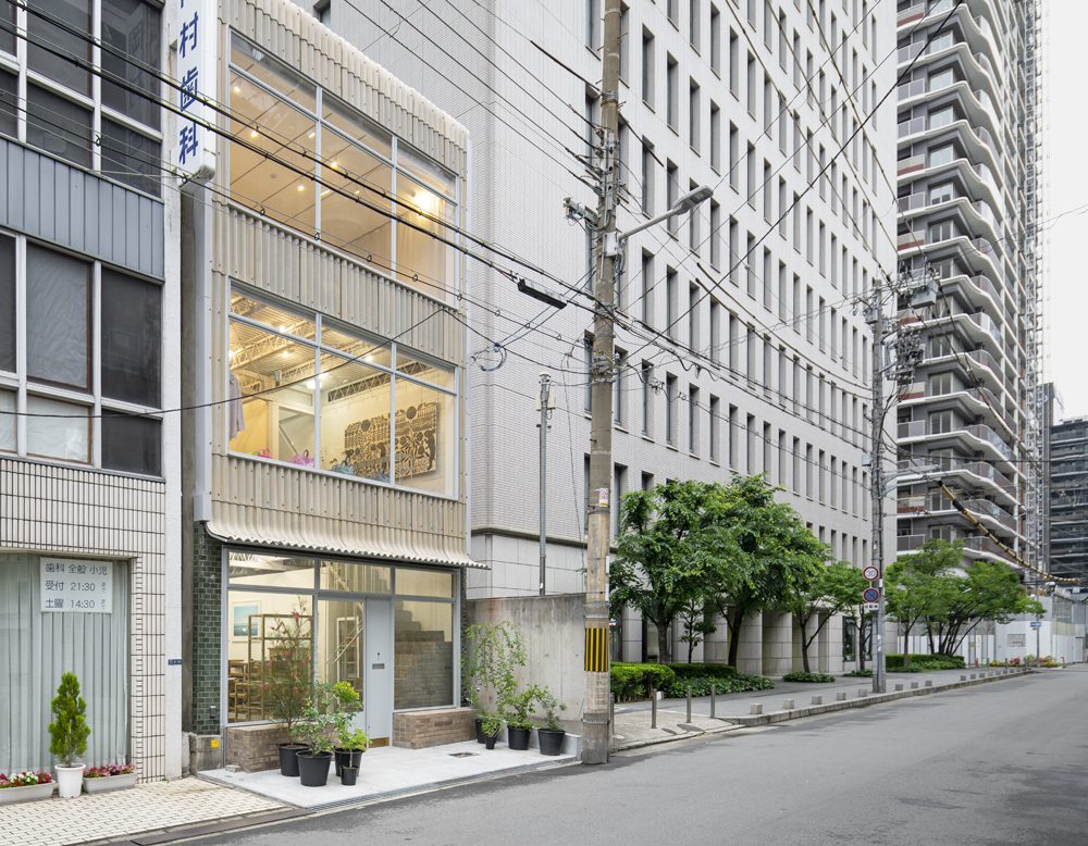
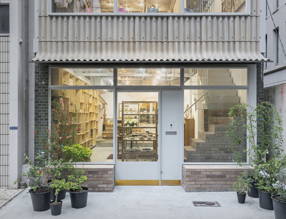
ファサード
大きくて華奢なサッシやペラペラのダンボールが張り付いたような外壁は、周りよりも低姿勢で、昔からそこにあったような柔らかい佇まいを生み出した。
重くなりすぎないよう、スレートの端部には既成の役物を使用し、曲線の柔らかさと見慣れたものの転用による ユーモアさ を加えた。
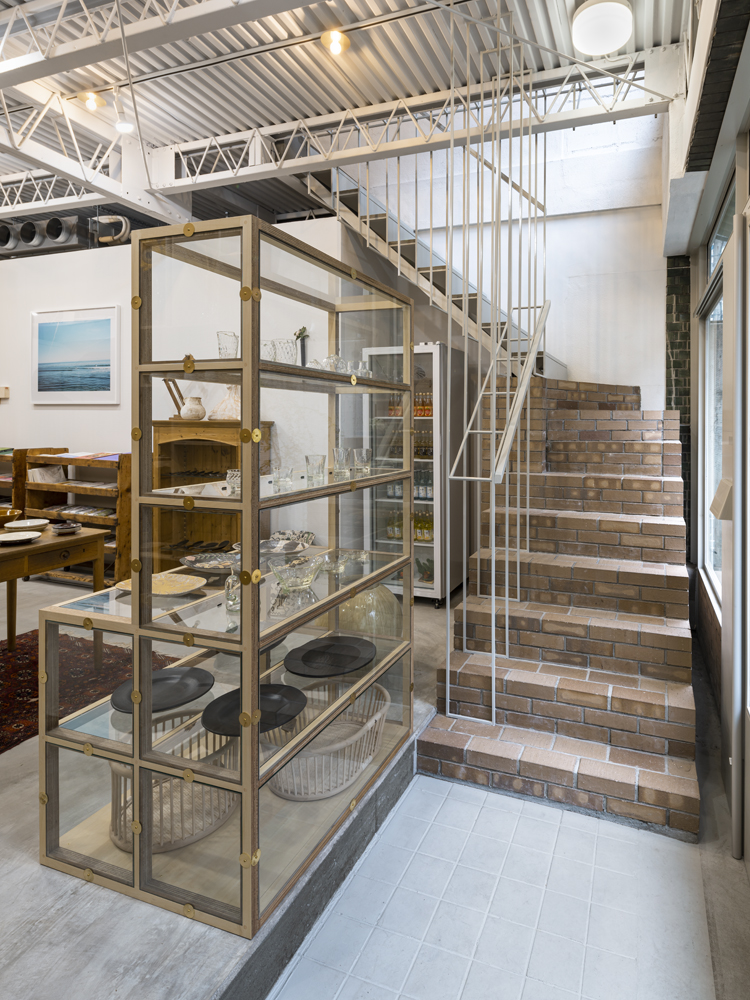
さらに、階段にも使用したレンガで内外の連続性をつくりつつ、ペラペラな外壁と対照的にヴォリュームとしてファサードから突き出させ、人やモノがエントランス周辺で滞留できるようにした。
慎重に色のバランスをとったスレートとレンガをファサードに使用することで、緑色の既存タイルも「和風」に見せずにファサードに取り込み、早速向かいの住人に「レトロだね」と言われる程度には、店舗が経てきた歴史を表現できた。
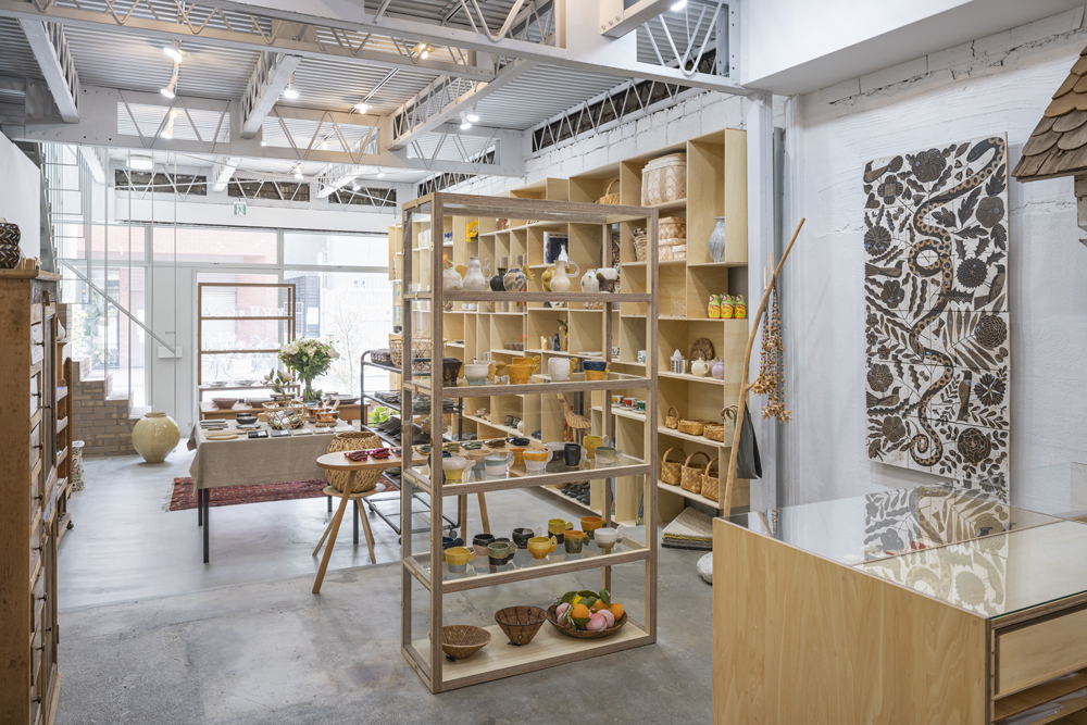
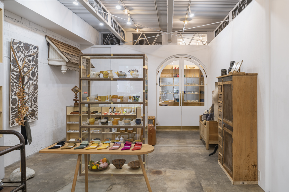
平面
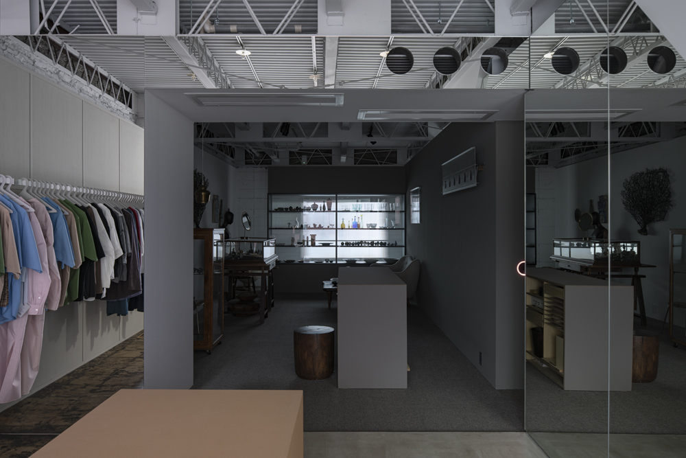
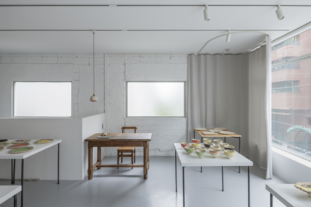
雑然として荒々しい仕上りの既存躯体や既存サッシは、上品な商品や什器に対してコントラストが強すぎるため、商品や什器に安定して視線が向くように、売場が既存躯体や既存サッシから距離を取り、直接面さず、ペリメーターゾーンが分節されるように、什器や諸室を配した。
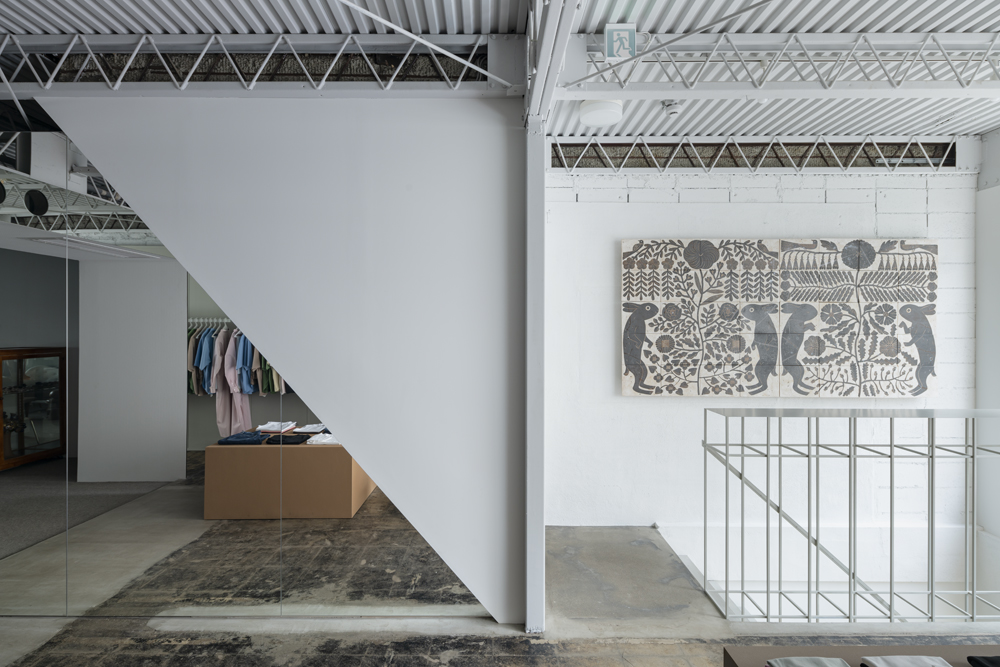
明確に切り分けられた空間ではないので、光や熱の変化は柔らかく伝わり、空間の連続性を感じる。そのため、粗雑な既存躯体/開口部は、装飾の少ない什器や壁によって隠されて、チラチラと見えがくれる装飾的な壁として知覚される。実際に見える範囲は小さいが、頭の中で補完して一般的な素材と粗雑な素材が拮抗しているように見え、対照法のように両者を特徴的なテクスチャーとして互いに互いを規定している。
キャラクター
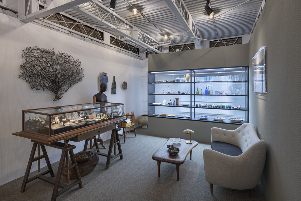
旧店舗には、オーナーが所有する数多くのアート、アンティーク什器があり、それらは商品とともに店の象徴であった。それぞれの店からの連続性を保つためにそれらを配置した。
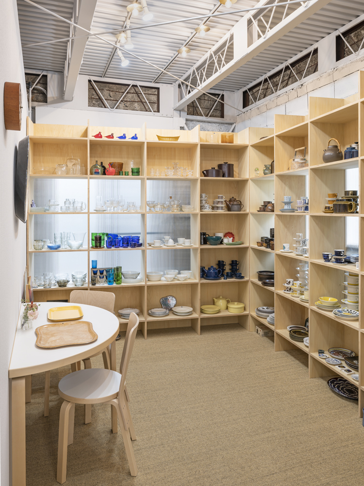
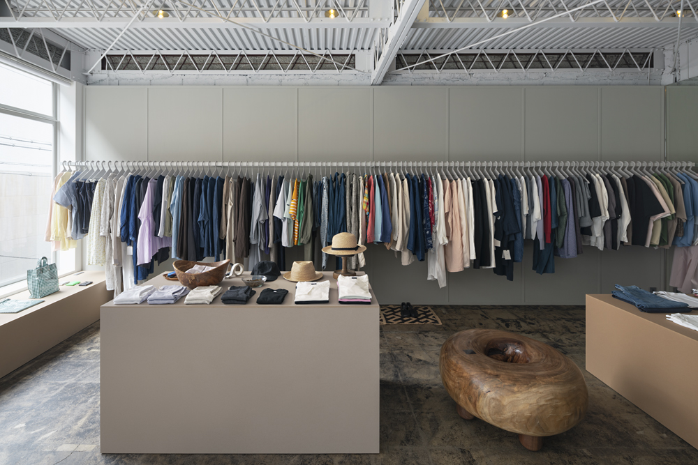
今までの店舗では、それらの存在は色調や様式が限定された規範内での個性として扱われていたが、今回の改修では、近過ぎず遠過ぎないキャラクターと混在させることで、色調や様式の調和にもう少しおおらかさをもたせて、常に統合への小さなせめぎあいが起こり、質素で簡素な新しい什器とアンティーク什器、商品、躯体の混在の中での、それぞれのキャラクターを再定義し、一つ一つのオブジェクトに新鮮な印象を与えた。
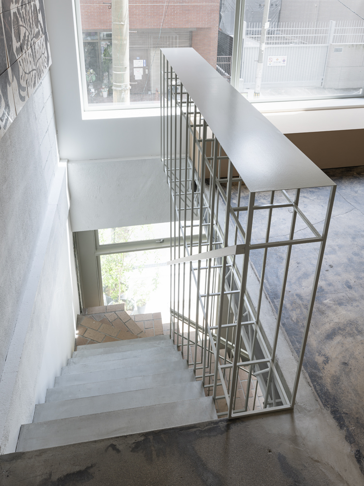
1fにはシンプルなシナ合板の箱組みをベースとした、比較的柔らかいがインダストリアルな佇まいのものや、ガラスと真鍮で硬質で華やかな佇まいのもの追加し、2Fには柔らかく上品なコルクボードの抽象的形態と初期モダニズムのような目板の壁面、1Fから立ち上がる立体格子の手すり、ウールの絨毯、スチールショーケース、階段の斜めのラインを利用した空間を区切り繋げる鏡など、トーンの違う多様なモダニズムを集合させた。
この空間は多様な商品や什器を陳列して初めて成立し、統合される複合的で即興的な店舗になった。
______
The project involved the refurbishment of an old, miscellaneous building and the reorganisation of four shops into a single shop.
The project required a sense of unity as a shop, while maintaining the character of each of the four shops.
As the shops have many fans, it was necessary to maintain the atmosphere of each shop, but at the same time the owners' expectations for change were also felt.
The theme of the project was to maintain the generous atmosphere of the existing shops while at the same time maintaining a crisp, fresh tension.
The facade was also required to give off such an air.
The idea was to eat up (use up) the building down to the smallest detail by adjusting the 'level' of the space.
Facade.
The large, slender sashes and flimsy, cardboard-studded exterior walls create a softer appearance, with a lower profile than its surroundings, as if it had been there for a long time.
To prevent the slate edges from becoming too heavy, pre-existing elements were used to add softness to the curves and a sense of humour through the use of familiar objects.
Furthermore, the bricks used for the staircase create a sense of continuity between the inside and outside, and in contrast to the flimsy exterior walls, they protrude from the façade as a volume, allowing people and objects to linger around the entrance area.
The use of slate and brick on the façade, carefully balanced in colour, brings the existing green tiles into the façade without making it look 'Japanese', and immediately expresses the history of the shop to the extent that the residents opposite say it is 'retro'.
Plane.
The existing frame and sashes, which have a cluttered and rough finish, contrast too strongly with the elegant products and fixtures, so the fixtures and rooms were arranged so that the sales floor is distant from the existing frame and sashes, not directly facing them, and the perimeter zone is divided, so that the eye is directed steadily towards the products and fixtures.
As the space is not clearly divided, changes in light and heat are softly transmitted and a sense of spatial continuity is felt. Therefore, the crude existing structure/openings are perceived as decorative walls that are hidden and glimpsed by the less decorative fixtures and walls. Although the actual visible area is small, the common and crude materials appear to be complementary and antagonistic in the mind, defining each other as characteristic textures, as in the contrast method.
Character.
The old shop contained numerous art and antique fixtures owned by the owners, which, along with the merchandise, were symbols of the shop. They were placed to maintain continuity from their respective shops.
In the previous shops, their presence was treated as individuality within a limited norm of colour tones and styles, but in this renovation, by mixing them with characters that are neither too close nor too far away, there is a little more generosity in the harmony of colour tones and styles, a small struggle for integration always occurs, and a new, simple, frugal and simple The mix of fixtures and antique fixtures, products and frames redefined the character of each, giving each object a fresh impression.
We added a relatively soft but industrial appearance based on a simple linden plywood box construction on the first floor, and a hard and glamorous appearance in glass and brass, while on the second floor we added soft and elegant corkboard abstract forms and early modernist-like eye board wall surfaces, and from the first floor The second floor is a collection of various modernisms in different tones, including a three-dimensional lattice railing rising from the first floor, wool carpets, steel showcases and mirrors that divide and connect the space using the diagonal lines of the staircase.
The space became a complex and improvised shop that could only be established and integrated by displaying a variety of products and fixtures.
4店舗それぞれのキャラクターを保ちつつも、店舗としての統一感を求められた。
また、ファンの多い店舗であり、それぞれの店舗の雰囲気を維持する必要があるが、同時にオーナーからの変化への期待も感じられた。
既存の店のおおらかな雰囲気を保ちつつもパリッとした新鮮な緊張感を両立させる事を主題とした。
そしてそのような空気を漂わせるファサードを求められた。
そこで、空間の「水準」を調整することで、細部まで建物を余すことなく食べ(使い)尽くすことを考えた。
ファサード
大きくて華奢なサッシやペラペラのダンボールが張り付いたような外壁は、周りよりも低姿勢で、昔からそこにあったような柔らかい佇まいを生み出した。
重くなりすぎないよう、スレートの端部には既成の役物を使用し、曲線の柔らかさと見慣れたものの転用による ユーモアさ を加えた。
さらに、階段にも使用したレンガで内外の連続性をつくりつつ、ペラペラな外壁と対照的にヴォリュームとしてファサードから突き出させ、人やモノがエントランス周辺で滞留できるようにした。
慎重に色のバランスをとったスレートとレンガをファサードに使用することで、緑色の既存タイルも「和風」に見せずにファサードに取り込み、早速向かいの住人に「レトロだね」と言われる程度には、店舗が経てきた歴史を表現できた。
平面
雑然として荒々しい仕上りの既存躯体や既存サッシは、上品な商品や什器に対してコントラストが強すぎるため、商品や什器に安定して視線が向くように、売場が既存躯体や既存サッシから距離を取り、直接面さず、ペリメーターゾーンが分節されるように、什器や諸室を配した。
明確に切り分けられた空間ではないので、光や熱の変化は柔らかく伝わり、空間の連続性を感じる。そのため、粗雑な既存躯体/開口部は、装飾の少ない什器や壁によって隠されて、チラチラと見えがくれる装飾的な壁として知覚される。実際に見える範囲は小さいが、頭の中で補完して一般的な素材と粗雑な素材が拮抗しているように見え、対照法のように両者を特徴的なテクスチャーとして互いに互いを規定している。
キャラクター
旧店舗には、オーナーが所有する数多くのアート、アンティーク什器があり、それらは商品とともに店の象徴であった。それぞれの店からの連続性を保つためにそれらを配置した。
今までの店舗では、それらの存在は色調や様式が限定された規範内での個性として扱われていたが、今回の改修では、近過ぎず遠過ぎないキャラクターと混在させることで、色調や様式の調和にもう少しおおらかさをもたせて、常に統合への小さなせめぎあいが起こり、質素で簡素な新しい什器とアンティーク什器、商品、躯体の混在の中での、それぞれのキャラクターを再定義し、一つ一つのオブジェクトに新鮮な印象を与えた。
1fにはシンプルなシナ合板の箱組みをベースとした、比較的柔らかいがインダストリアルな佇まいのものや、ガラスと真鍮で硬質で華やかな佇まいのもの追加し、2Fには柔らかく上品なコルクボードの抽象的形態と初期モダニズムのような目板の壁面、1Fから立ち上がる立体格子の手すり、ウールの絨毯、スチールショーケース、階段の斜めのラインを利用した空間を区切り繋げる鏡など、トーンの違う多様なモダニズムを集合させた。
この空間は多様な商品や什器を陳列して初めて成立し、統合される複合的で即興的な店舗になった。
______
The project involved the refurbishment of an old, miscellaneous building and the reorganisation of four shops into a single shop.
The project required a sense of unity as a shop, while maintaining the character of each of the four shops.
As the shops have many fans, it was necessary to maintain the atmosphere of each shop, but at the same time the owners' expectations for change were also felt.
The theme of the project was to maintain the generous atmosphere of the existing shops while at the same time maintaining a crisp, fresh tension.
The facade was also required to give off such an air.
The idea was to eat up (use up) the building down to the smallest detail by adjusting the 'level' of the space.
Facade.
The large, slender sashes and flimsy, cardboard-studded exterior walls create a softer appearance, with a lower profile than its surroundings, as if it had been there for a long time.
To prevent the slate edges from becoming too heavy, pre-existing elements were used to add softness to the curves and a sense of humour through the use of familiar objects.
Furthermore, the bricks used for the staircase create a sense of continuity between the inside and outside, and in contrast to the flimsy exterior walls, they protrude from the façade as a volume, allowing people and objects to linger around the entrance area.
The use of slate and brick on the façade, carefully balanced in colour, brings the existing green tiles into the façade without making it look 'Japanese', and immediately expresses the history of the shop to the extent that the residents opposite say it is 'retro'.
Plane.
The existing frame and sashes, which have a cluttered and rough finish, contrast too strongly with the elegant products and fixtures, so the fixtures and rooms were arranged so that the sales floor is distant from the existing frame and sashes, not directly facing them, and the perimeter zone is divided, so that the eye is directed steadily towards the products and fixtures.
As the space is not clearly divided, changes in light and heat are softly transmitted and a sense of spatial continuity is felt. Therefore, the crude existing structure/openings are perceived as decorative walls that are hidden and glimpsed by the less decorative fixtures and walls. Although the actual visible area is small, the common and crude materials appear to be complementary and antagonistic in the mind, defining each other as characteristic textures, as in the contrast method.
Character.
The old shop contained numerous art and antique fixtures owned by the owners, which, along with the merchandise, were symbols of the shop. They were placed to maintain continuity from their respective shops.
In the previous shops, their presence was treated as individuality within a limited norm of colour tones and styles, but in this renovation, by mixing them with characters that are neither too close nor too far away, there is a little more generosity in the harmony of colour tones and styles, a small struggle for integration always occurs, and a new, simple, frugal and simple The mix of fixtures and antique fixtures, products and frames redefined the character of each, giving each object a fresh impression.
We added a relatively soft but industrial appearance based on a simple linden plywood box construction on the first floor, and a hard and glamorous appearance in glass and brass, while on the second floor we added soft and elegant corkboard abstract forms and early modernist-like eye board wall surfaces, and from the first floor The second floor is a collection of various modernisms in different tones, including a three-dimensional lattice railing rising from the first floor, wool carpets, steel showcases and mirrors that divide and connect the space using the diagonal lines of the staircase.
The space became a complex and improvised shop that could only be established and integrated by displaying a variety of products and fixtures.