
Interior design of the cafe in the nightlife district.
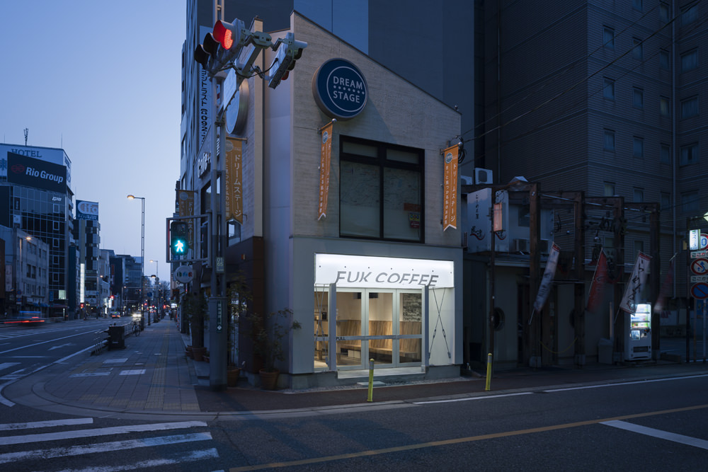
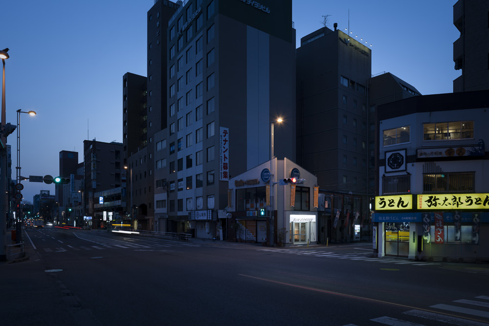
The plot is on the corner along a river that separates the shopping and office areas from the nightlife district, like the river Styx, it was requested to satisfy contradictory requirements such as popularity reaching a wide range of customers and the edge feeling to experience newness, an atmosphere that is calm and can not stay on too long time.
Also, how to show clearly that 1,2F is a different shop was a big problem, because it have to divide the property into two tenants, originally used by one tenant at one entrance,.
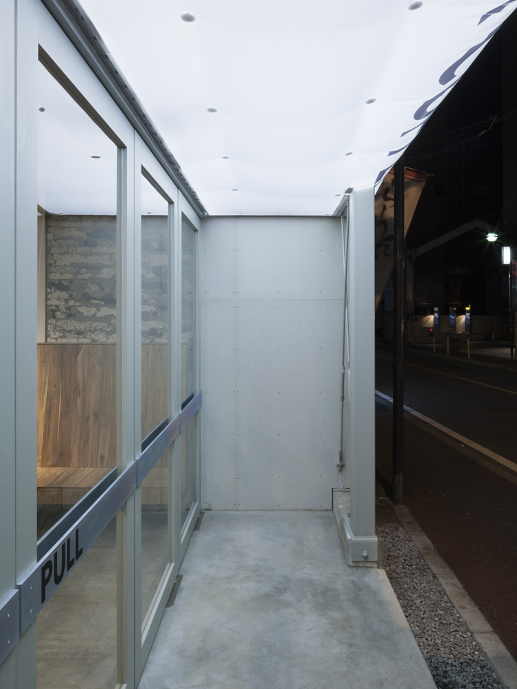
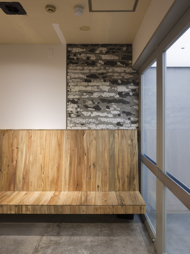
At first, a new entrance was made on the other side in front of the smaller way instead of the main street, a new wall was set up based on the existing staircase in the room, and separate 1F and 2F as two different tenant. In addition, the eave is made in order to stay under it.
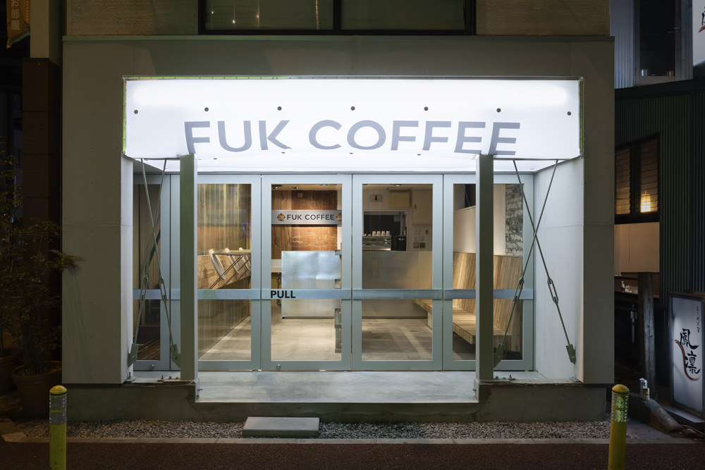
Although it is an intrinsic signboard that shines brilliantly like as the neighbour's signboard in the nightlife district, the signboard is made of inflatable signboard that inflates with the exhaust of the room. As a result, the light shape make soft and obscure, the signboard become a cute pop icon against the urban atmosphere.
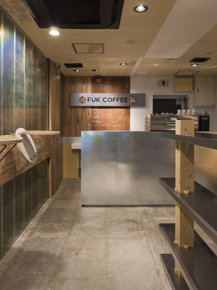
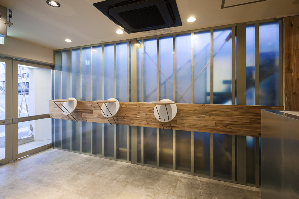
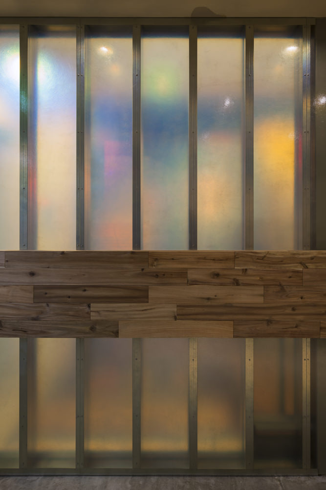
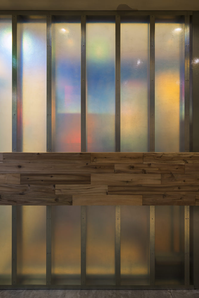
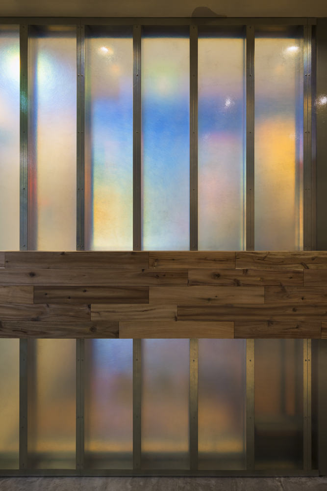
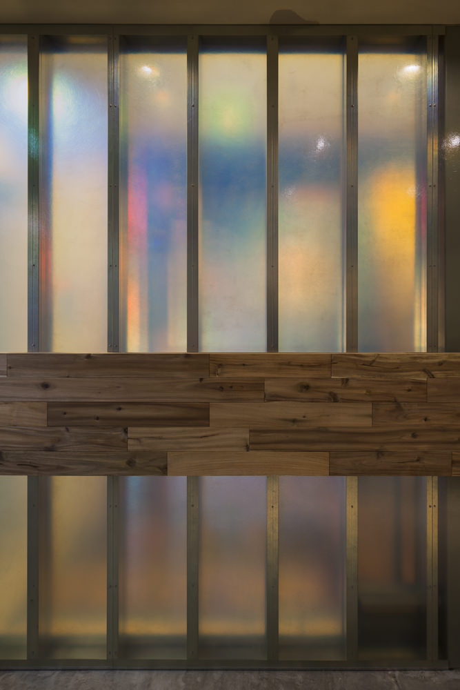
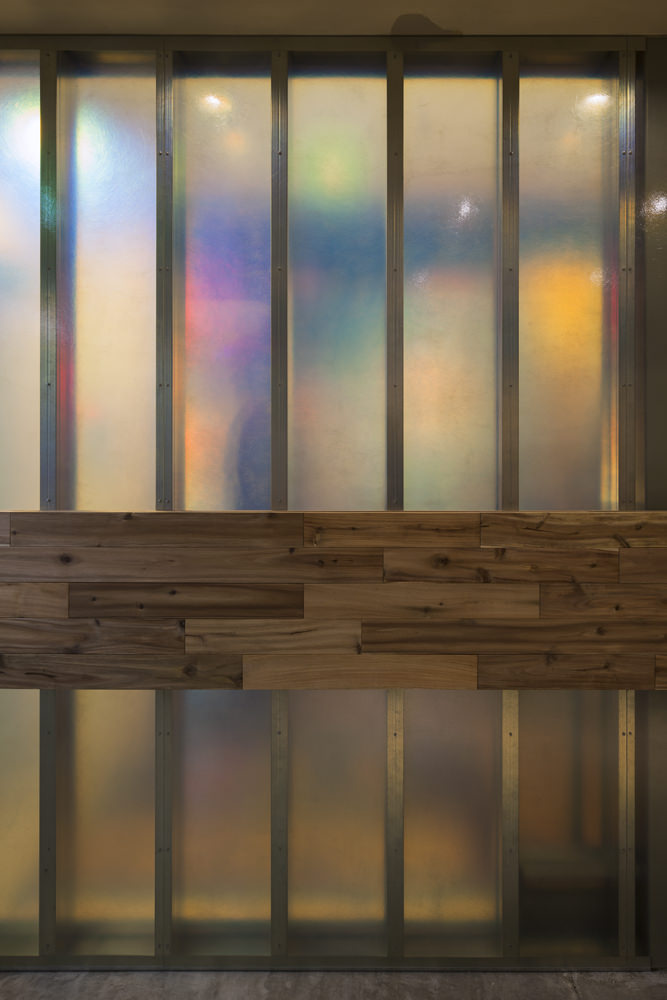
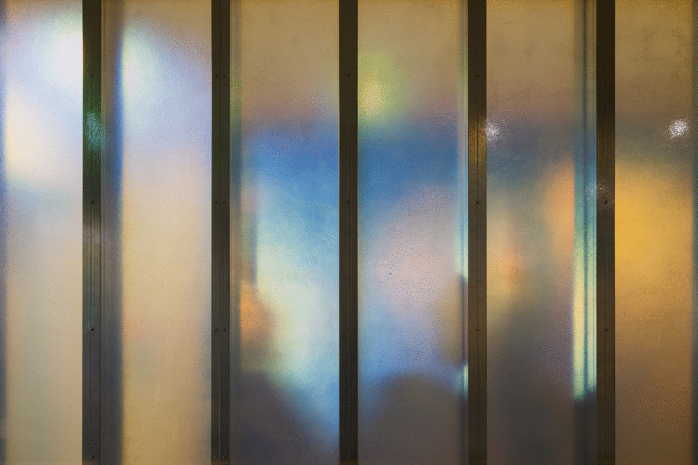
The wall beside the stairs was made of a material that separates light into spectrum. This wall became a screen that amplifies and projects the light and shadow of a boulevard car or crowd like a shadowy picture and a shadow play of multi-color, and it is a space let us feel a urban atmosphere that soft light and gorgeousness fills the room.
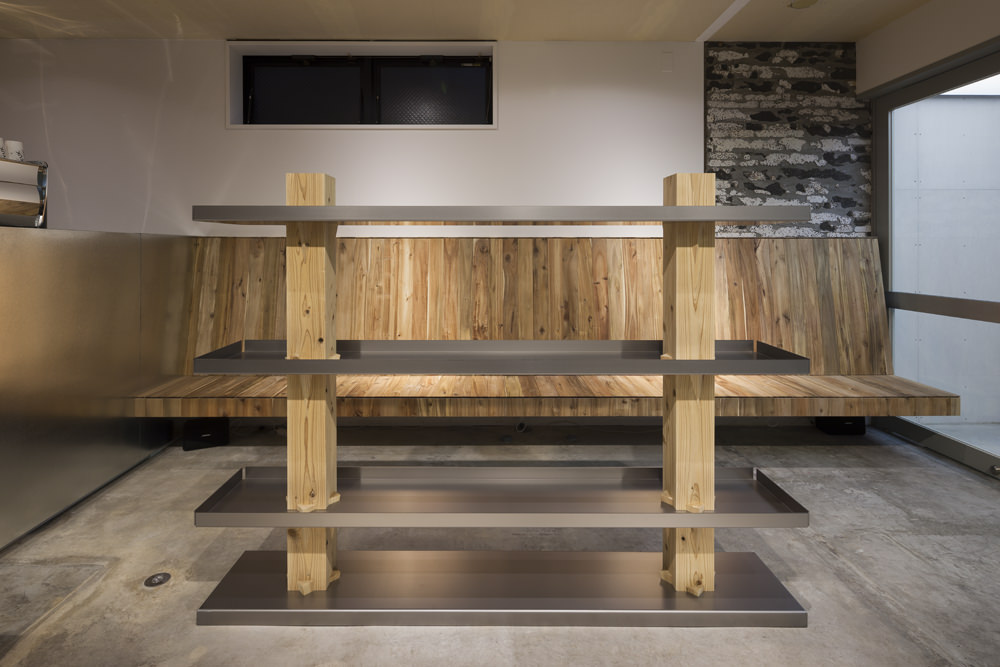
The inside is made of a material that is simple and easy to understand, such as a cafe-like material. The signboard and semitransparent walls were too strong and we kept it in a casual atmosphere easy for anyone to enter so that we would not lose the café likeness.
歓楽街にあるカフェの内装設計。
ショッピング・オフィスエリアと歓楽街エリアを分ける三途の河のような川沿いにあり、幅広い客層に届くポップさと新しさを味わえるエッジ感、落ち着ける雰囲気と居座れない雰囲気など、相反する要求を上手く満たすことが求められた。
また、元々一つの入り口で一つのテナントによって使われていた物件を、上下階で二つのテナントに分けるため、1,2Fが違う店であることをどう示すかも、大きな問題点であった。
そこで、まずは大通りではなく小道側に入り口を別に新設し、室内にある既存階段を拠り所として半透明の壁を設け、1Fと2Fを別々の空間に分けた。また、滞留できるスペースとして、庇下の空間を設けた。
看板は、周囲の内照看板と同じように、煌々と光る内照看板としながらも、室内の排気で膨らませるインフレート看板とすることで、都市的な雰囲気の中にも、柔らかい形とボンヤリと光る可愛らしさのあるアイコンとして機能するよう考えた。
階段横の半透明の壁は光を虹色に分光する素材でつくった。この壁は、大通りの車や人の光や影を多色刷りの影絵のように増幅して投影するスクリーンとなり、室内を柔らかい光と華やかさが満たし、都市的な雰囲気を感じさせる。
店内は単純で分かりやすい形を、しごくカフェらしい素材でつくった。看板や半透明の壁が強すぎて、カフェらしさを無くしてしまわないよう、誰でも入りやすいカジュアルな雰囲気に留めた。
The plot is on the corner along a river that separates the shopping and office areas from the nightlife district, like the river Styx, it was requested to satisfy contradictory requirements such as popularity reaching a wide range of customers and the edge feeling to experience newness, an atmosphere that is calm and can not stay on too long time.
Also, how to show clearly that 1,2F is a different shop was a big problem, because it have to divide the property into two tenants, originally used by one tenant at one entrance,.
At first, a new entrance was made on the other side in front of the smaller way instead of the main street, a new wall was set up based on the existing staircase in the room, and separate 1F and 2F as two different tenant. In addition, the eave is made in order to stay under it.
Although it is an intrinsic signboard that shines brilliantly like as the neighbour's signboard in the nightlife district, the signboard is made of inflatable signboard that inflates with the exhaust of the room. As a result, the light shape make soft and obscure, the signboard become a cute pop icon against the urban atmosphere.
The wall beside the stairs was made of a material that separates light into spectrum. This wall became a screen that amplifies and projects the light and shadow of a boulevard car or crowd like a shadowy picture and a shadow play of multi-color, and it is a space let us feel a urban atmosphere that soft light and gorgeousness fills the room.
The inside is made of a material that is simple and easy to understand, such as a cafe-like material. The signboard and semitransparent walls were too strong and we kept it in a casual atmosphere easy for anyone to enter so that we would not lose the café likeness.
歓楽街にあるカフェの内装設計。
ショッピング・オフィスエリアと歓楽街エリアを分ける三途の河のような川沿いにあり、幅広い客層に届くポップさと新しさを味わえるエッジ感、落ち着ける雰囲気と居座れない雰囲気など、相反する要求を上手く満たすことが求められた。
また、元々一つの入り口で一つのテナントによって使われていた物件を、上下階で二つのテナントに分けるため、1,2Fが違う店であることをどう示すかも、大きな問題点であった。
そこで、まずは大通りではなく小道側に入り口を別に新設し、室内にある既存階段を拠り所として半透明の壁を設け、1Fと2Fを別々の空間に分けた。また、滞留できるスペースとして、庇下の空間を設けた。
看板は、周囲の内照看板と同じように、煌々と光る内照看板としながらも、室内の排気で膨らませるインフレート看板とすることで、都市的な雰囲気の中にも、柔らかい形とボンヤリと光る可愛らしさのあるアイコンとして機能するよう考えた。
階段横の半透明の壁は光を虹色に分光する素材でつくった。この壁は、大通りの車や人の光や影を多色刷りの影絵のように増幅して投影するスクリーンとなり、室内を柔らかい光と華やかさが満たし、都市的な雰囲気を感じさせる。
店内は単純で分かりやすい形を、しごくカフェらしい素材でつくった。看板や半透明の壁が強すぎて、カフェらしさを無くしてしまわないよう、誰でも入りやすいカジュアルな雰囲気に留めた。